Kup stronę 60% Taniej
BLACK MONTH
BLACK MONTH
Do końca 2 DNI : 2 GODZIN : 2 MINUT : 2 SEKUND

Categories.
WebWave drag and drop website builder lets you create unique websites. You can build your website from scratch by starting with a blank page, or choose various website templates from our free collection and modify them according to your needs. With WebWave website builder, you have a complete website design and hosting system at your fingertips.
This website was created with WebWave.
Find us online
Contact.
Email us at:
contact@webwave.me
Or use the chat (Mon-Fri)
Website builder.
Offer.
Useful articles.
Breakpoints - what is it?
Breakpoint is a limit point that serves as a benchmark for providing the best possible layout that in turn enables users to consume or understand your site's content. When you first begin to work with Responsive Design, you will define your breakpoints for the four devices widths:

| Desktop | 1200px |
| Tablet | 768px |
| Horizontal phone | 480px |
| Vertical phone | 320px |
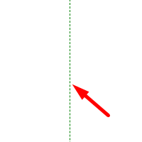
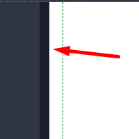
Breakpoints in website builder WebWave in Desktop mode are marked with black dotted line. In any other mode breakpoints are specified as the endings of working space.
| Dektop | RWD |
|
|
How to change default breakpoints
You can change value of device breakpoint by hovering on the device button and changing an input field.

Keep in mind:
- Device width value is the same for all the webpages.
- It's not recommended to change breakpoints values when you've set elements on the website in all the resolutions before.