Kup stronę 60% Taniej
BLACK MONTH
BLACK MONTH
Do końca 2 DNI : 2 GODZIN : 2 MINUT : 2 SEKUND
Categories.
WebWave drag and drop website builder lets you create unique websites. You can build your website from scratch by starting with a blank page, or choose various website templates from our free collection and modify them according to your needs. With WebWave website builder, you have a complete website design and hosting system at your fingertips.
This website was created with WebWave.
Find us online
Contact.
Email us at:
contact@webwave.me
Or use the chat (Mon-Fri)
Website builder.
Offer.
Useful articles.
First responsive website (RWD)
Before we get started, let's clarify what responsive website is. Responsive web design (RWD) is an approach to web design that makes web pages match the screen sizes on a variety of devices. Regardless of the device you are viewing your website at, it should be displayed properly. What is more, you can change an elements style and size in every website version: for desktop, tablet or mobile. It is impossible to modify in websites of "mobile" type. Read more about differences between responsive and mobile website.
In order to create your first responsive website, you should finish your website project for desktops first. Once you are done with it, read the article below and get started with building your first responsive website.
Building a responsive website is mainly adjusting the project you have created to the other screen sizes by modifying the content and size of elements to breakpoints. Why to breakpoints? Because everything outside breakpoints is not visible to a user.
Activating RWD modes
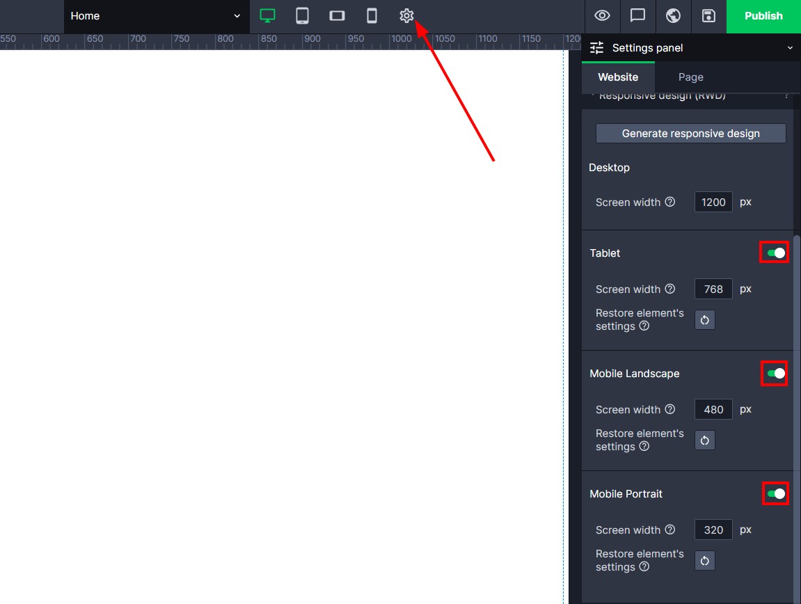
On the top bar, click on the gear icon, which takes you to the "Settings panel" -> "Site" -> "Responsive design (RWD)" Next to the different RWD modes, we move the slider to the right side.
Select a screen type
In our case it will be a tablet, so we click on the icon that represents it.
Resetting the RWD settings for the selected mode.
To reset the setting of all elements on a particular mode, go to "Settings Panel" -> "Page" -> "Screens of different sizes (RWD)", click the restore icon.
Note! That the view will reset only on the given subpage.
Resetting element position settings on the selected RWD mode.
To reset the element position settings on the selected RWD mode, go to edit your page, select the elements for which you want to reset the setting, then in the "Settings Panel" -> "Subpage" -> "Responsive design (RWD)", click the restore icon.
Separate object linking for different RWD versions
You already made a page where you have binds, but you would like the page to be different in the order of elements or layout in the phone view? Nothing simpler, just select an element, go to the settings panel, and then to the "Bound Objects" tab. Click the button "bind for RWD differently" and set your own conditions on how these binds should look like in one of the mobile views:
Select a screen type
Adjust
The elements layout is normally copied from the Desktop version which has different width and height. Now you have to adjust each element separately to make sure it fit the mobile screen (in this case).
Adjusting elements layout shouldn't take long, but everything depends on the website and the number of modifications you want to apply.
It might turn out that the content or menu, which you created for Desktop version, need to be changed. Read more about possible solutions on how to place elements differently or create them again from scratch. The helpful thing to know would be how to hide elements as well.
Adjusting elements looks the same for each website version.
Disable RWD
If you decide you don't need RWD now, you can turn it off by moving the slider to the left.


