Kup stronę 60% Taniej
BLACK MONTH
BLACK MONTH
Do końca 2 DNI : 2 GODZIN : 2 MINUT : 2 SEKUND

Categories.
WebWave drag and drop website builder lets you create unique websites. You can build your website from scratch by starting with a blank page, or choose various website templates from our free collection and modify them according to your needs. With WebWave website builder, you have a complete website design and hosting system at your fingertips.
This website was created with WebWave.
Find us online
Contact.
Email us at:
contact@webwave.me
Or use the chat (Mon-Fri)
Website builder.
Offer.
Useful articles.
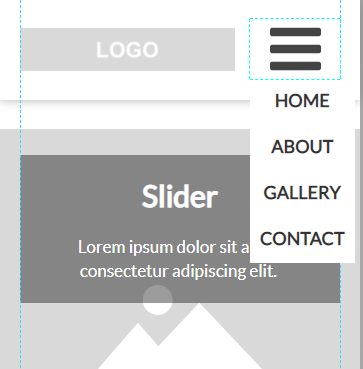
How to add a mobile menu to your website?
It is a common practice to replace regular menu on the mobile version with a so called "hamburger" . In this article you will learn how to do that in website builder WebWave.

Creating a "hamburger" menu in WebWave
In order to create a "hamburger" menu, enter a mobile version of your website (more about RWD read here) and in the side edition panel in "Menu settings" select "Menu type: Mobile".

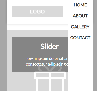
You can customize menu to look exactly how you want it to look. Change the menu width, position and image so it perfectly suits your project.

- Menu type - select what type of menu has to be in the mobile version of your website.
- Image - if you don't like a default image of "hamburger" menu, you can easily change it.
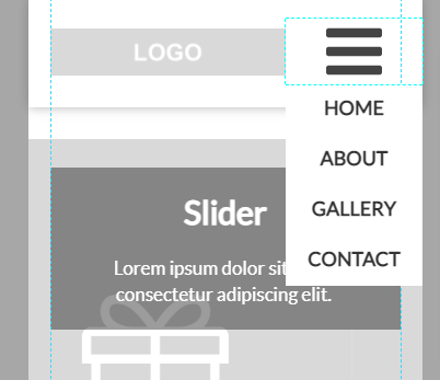
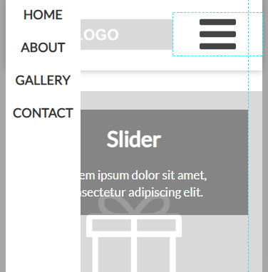
- Menu position - pick out a place where the menu should be displayed on mobile devices:
- Below the element - menu rolls out under the menu. After selecting this option you can also choose the menu width:
- 100% - menu rolls out having a 100% width of the whole screen
- Auto - menu rolls out having a width of its broadest element
- Element's width - menu rolls out and have a width of the menu icon
- 100% - menu rolls out having a 100% width of the whole screen
- the left edge of a screen
- the right edge of a screen
- Below the element - menu rolls out under the menu. After selecting this option you can also choose the menu width:
As you can see, mobile menu features give you a lot of opportunities of making the mobile menu match your website just like you want it.